100 Day Map Challenge
Data Visualization and GIS | 2025 | Designed using R, Arcgis Pro, Tableau, QGIS, and D3
I'm kicking off a 100-day challenge to create a new map each day, inspired by the 100 Day Project. It's a chance for me to dive into GIS, experiment with different mapping techniques, and get better at using different tools. The author of the 100 Day Project outlines three main reasons people join these challenges: to play and enjoy the process, to practice and improve their skills, or to produce a tangible result. I'm taking part in this challenge to get better at what I do and to build a portfolio I can be proud of.
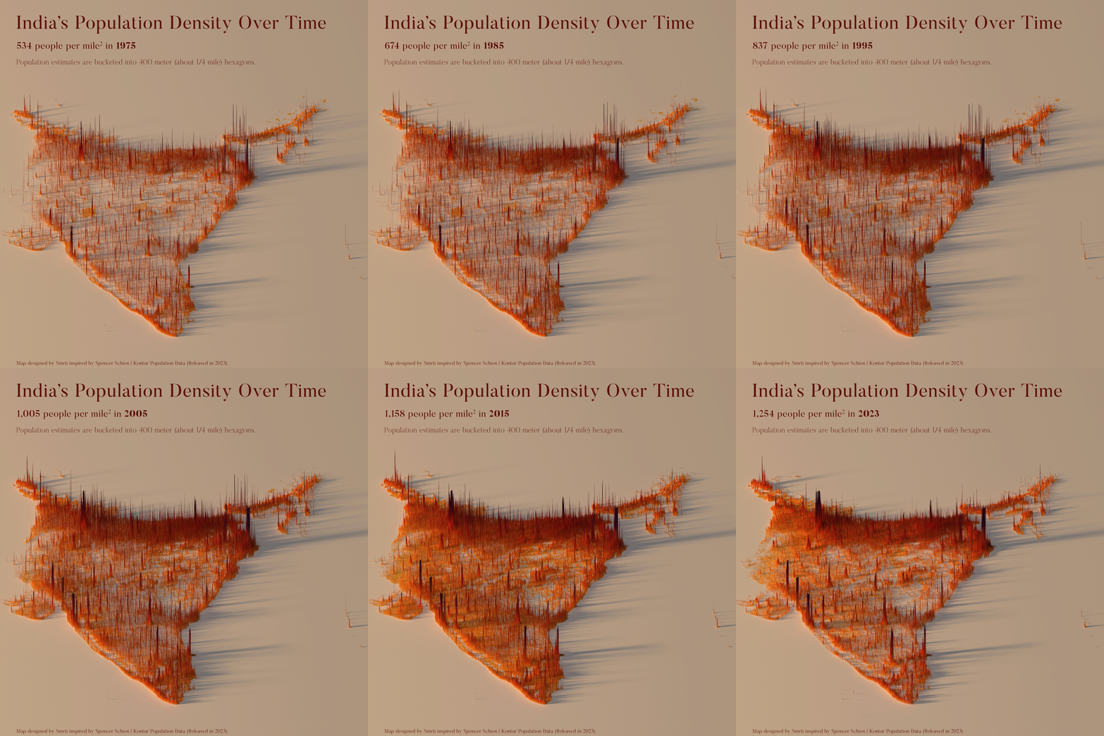
Day 1: This 3D map visualizes population density changes in India from 1785 to 2023. Created in R Studio using ggplot and rayshader, it's inspired by Spencer Schien’s work. The data comes from Kontur Population: Global Population Density for 400m H3 Hexagons.


